---
title: "Jupyter Notebook Integration with Quarto"
date: 2024-02-11
description: "Comprehensive guide to using Jupyter notebooks with Quarto for interactive data science and research"
tags: ["Jupyter", "Python", "Data Science", "Interactive", "Notebooks", "Quarto"]
execute:
echo: true
eval: true
---
Quarto seamlessly integrates with Jupyter notebooks, allowing you to write computational documents that combine code, output, narrative text, and visualizations. This page showcases the power of Jupyter notebooks within Quarto!
## What are Jupyter Notebooks?
Jupyter notebooks are interactive computing environments that allow you to write and execute code in cells, mixing them with markdown documentation and visualizations. They're particularly powerful for:
- **Data Analysis**: Explore and visualize data interactively
- **Research**: Document methodology and results together
- **Education**: Create tutorials with executable examples
- **Reporting**: Generate dynamic reports that update when data changes
## Code Execution in Jupyter Notebooks
Let's start with basic data analysis:
```{python}
import pandas as pd
import numpy as np
import matplotlib.pyplot as plt
import seaborn as sns

# Set style for better-looking plots
sns.set_style("darkgrid")
plt.rcParams['figure.figsize'] = (12, 6)

# Create sample dataset
np.random.seed(42)
n = 100
data = pd.DataFrame({
    'x': np.linspace(0, 10, n),
    'y': np.linspace(0, 10, n) + np.random.normal(0, 1.5, n),
    'category': np.random.choice(['A', 'B', 'C'], n)
})

print("Dataset Summary:")
print(data.describe())
```
## Interactive Visualizations
Create publication-quality plots directly in your documents:
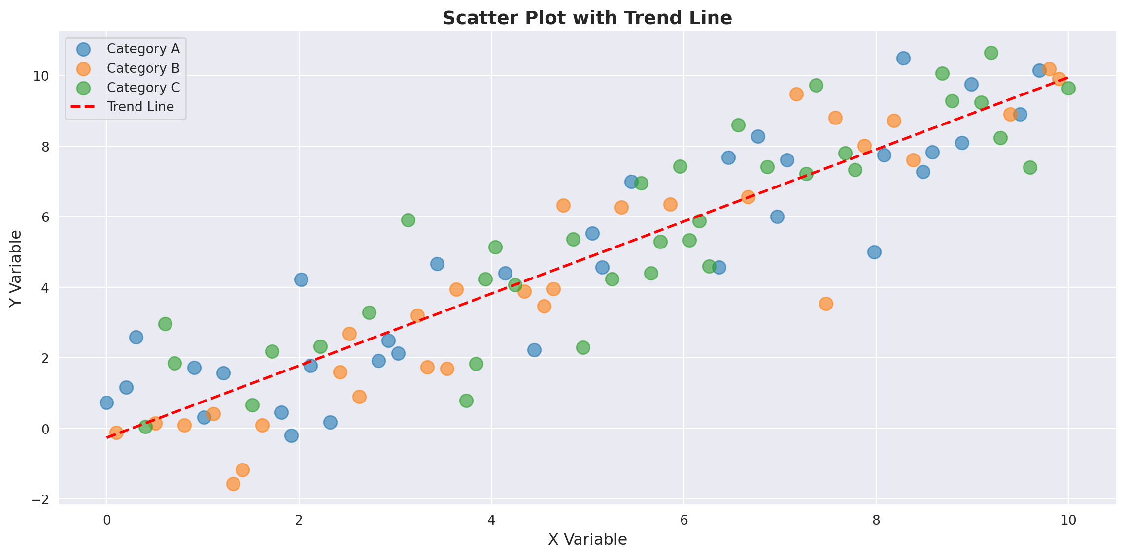
```{python}
# Create a scatter plot with regression line
fig, ax = plt.subplots()
for cat in ['A', 'B', 'C']:
    mask = data['category'] == cat
    ax.scatter(data[mask]['x'], data[mask]['y'], label=f'Category {cat}', alpha=0.6, s=100)

# Add trend line
z = np.polyfit(data['x'], data['y'], 1)
p = np.poly1d(z)
ax.plot(data['x'], p(data['x']), "r--", linewidth=2, label='Trend Line')

ax.set_xlabel('X Variable', fontsize=12)
ax.set_ylabel('Y Variable', fontsize=12)
ax.set_title('Scatter Plot with Trend Line', fontsize=14, fontweight='bold')
ax.legend()
plt.tight_layout()
plt.show()

print(f"\nTrend line equation: y = {z[0]:.3f}x + {z[1]:.3f}")
```
## Statistical Analysis
Perform and document statistical tests:
```{python}
from scipy import stats

# Test if groups are different
groups = [data[data['category'] == cat]['y'].values for cat in ['A', 'B', 'C']]
f_stat, p_value = stats.f_oneway(*groups)

print("ANOVA Test Results:")
print(f"F-statistic: {f_stat:.4f}")
print(f"P-value: {p_value:.4f}")

if p_value < 0.05:
    print("Result: Groups are significantly different (p < 0.05)")
else:
    print("Result: Groups are NOT significantly different (p >= 0.05)")
```
## Data Transformation and Processing
Show step-by-step data processing:
```{python}
# Group by category and calculate statistics
grouped_stats = data.groupby('category').agg({
    'x': ['mean', 'std', 'min', 'max'],
    'y': ['mean', 'std', 'min', 'max']
}).round(3)

print("\nGrouped Statistics:")
print(grouped_stats)

# Create a new feature
data['z'] = data['x'] + data['y']
data['ratio'] = data['y'] / (data['x'] + 1)

print("\nFirst few rows with new features:")
print(data.head())
```
## Advanced Visualization
Create more complex multi-panel visualizations:
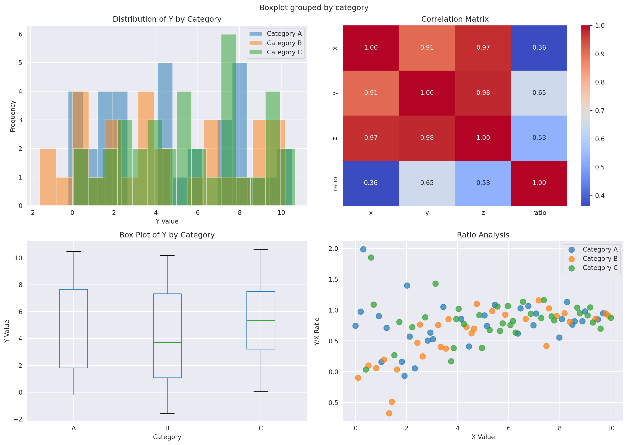
```{python}
fig, axes = plt.subplots(2, 2, figsize=(14, 10))

# Plot 1: Distribution of y by category
for cat in ['A', 'B', 'C']:
    mask = data['category'] == cat
    axes[0, 0].hist(data[mask]['y'], alpha=0.5, label=f'Category {cat}', bins=15)
axes[0, 0].set_xlabel('Y Value')
axes[0, 0].set_ylabel('Frequency')
axes[0, 0].set_title('Distribution of Y by Category')
axes[0, 0].legend()

# Plot 2: Heatmap of correlation
corr_data = data[['x', 'y', 'z', 'ratio']].corr()
sns.heatmap(corr_data, annot=True, fmt='.2f', cmap='coolwarm', ax=axes[0, 1], cbar=True)
axes[0, 1].set_title('Correlation Matrix')

# Plot 3: Box plot
data.boxplot(column='y', by='category', ax=axes[1, 0])
axes[1, 0].set_xlabel('Category')
axes[1, 0].set_ylabel('Y Value')
axes[1, 0].set_title('Box Plot of Y by Category')
plt.sca(axes[1, 0])
plt.xticks(rotation=0)

# Plot 4: Pair plot-like scatter
for i, cat in enumerate(['A', 'B', 'C']):
    mask = data['category'] == cat
    axes[1, 1].scatter(data[mask]['x'], data[mask]['ratio'], label=f'Category {cat}', s=80, alpha=0.7)
axes[1, 1].set_xlabel('X Value')
axes[1, 1].set_ylabel('Y/X Ratio')
axes[1, 1].set_title('Ratio Analysis')
axes[1, 1].legend()

plt.tight_layout()
plt.show()
```
::: {.callout-tip}
## Benefits of Jupyter Notebooks in Quarto
- **Reproducibility**: Code and output are always in sync
- **Interactivity**: Run code sections individually during development
- **Documentation**: Mix code, results, and narrative seamlessly
- **Versioning**: Track changes to computational documents in Git
- **Publishing**: Export to HTML, PDF, or other formats
- **Collaboration**: Share notebooks that others can run and modify
:::
## Machine Learning Example
A quick machine learning pipeline example:
```{python}
from sklearn.model_selection import train_test_split
from sklearn.preprocessing import StandardScaler
from sklearn.linear_model import LinearRegression
from sklearn.metrics import mean_squared_error, r2_score

# Prepare data for modeling
X = data[['x', 'z']].values
y = data['y'].values

# Split data
X_train, X_test, y_train, y_test = train_test_split(X, y, test_size=0.2, random_state=42)

# Scale features
scaler = StandardScaler()
X_train_scaled = scaler.fit_transform(X_train)
X_test_scaled = scaler.transform(X_test)

# Train model
model = LinearRegression()
model.fit(X_train_scaled, y_train)

# Evaluate
y_pred_train = model.predict(X_train_scaled)
y_pred_test = model.predict(X_test_scaled)

train_r2 = r2_score(y_train, y_pred_train)
test_r2 = r2_score(y_test, y_pred_test)
test_mse = mean_squared_error(y_test, y_pred_test)

print("\nModel Performance:")
print(f"Training R²: {train_r2:.4f}")
print(f"Testing R²:  {test_r2:.4f}")
print(f"Test MSE:    {test_mse:.4f}")
print(f"\nModel Coefficients:")
for i, coef in enumerate(model.coef_):
    print(f"  Feature {i}: {coef:.4f}")
print(f"Intercept: {model.intercept_:.4f}")
```
## Next Steps
Now that you understand the power of Jupyter notebooks in Quarto:
1. **Create your own**: Write `.ipynb` files or `.qmd` files with code cells
2. **Explore interactivity**: Add [Observable JavaScript](https://quarto.org/docs/interactive/ojs/) for client-side interactivity
3. **Build dashboards**: Use [Quarto dashboards](https://quarto.org/docs/dashboards/) to create interactive data apps
4. **Share knowledge**: Publish your notebooks on GitHub or your personal website
::: {.callout-important}
## Learn More
- [Quarto Documentation](https://quarto.org/docs/)
- [Jupyter Project](https://jupyter.org/)
- [Python Data Science Stack](https://pandas.pydata.org/)
- [Matplotlib & Seaborn](https://matplotlib.org/)
:::
Happy data science! 🚀📊