---
title: "Pinball Loss: Quantile Regression Visualization"
date: 2024-02-11
description: "Understanding Pinball Loss and its applications in quantile regression with interactive visualizations"
tags: ["Machine Learning", "Quantile Regression", "Loss Functions", "Statistics", "Python", "Jupyter"]
execute:
echo: true
eval: true
format:
html: default
pdf: default
---
## Introduction to Pinball Loss
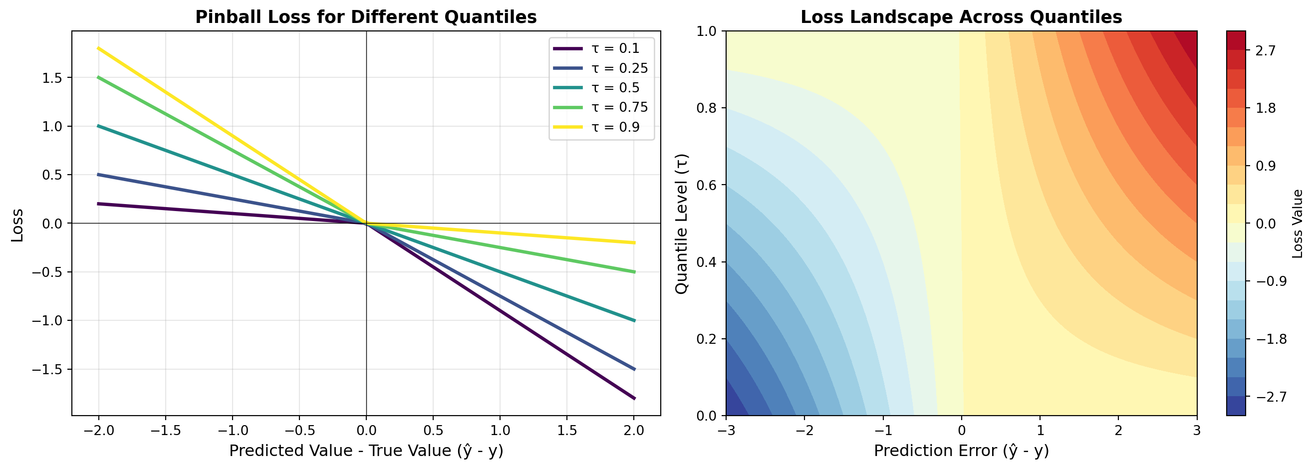
The **Pinball Loss** (also called Quantile Loss) is a loss function used in quantile regression. Unlike mean absolute error or mean squared error which predict the mean of a distribution, quantile regression allows us to predict any quantile of the conditional distribution of the response variable.
## Mathematical Definition
The pinball loss function is defined as:
$$L_\tau(y, \hat{y}) = \begin{cases}
\tau(y - \hat{y}) & \text{if } y \geq \hat{y} \\
(1-\tau)(y - \hat{y}) & \text{if } y < \hat{y}
\end{cases}$$
where $\tau \in [0, 1]$ is the quantile level. This can also be written more compactly as:
$$L_\tau(y, \hat{y}) = (y - \hat{y})(\tau - \mathbb{1}_{y < \hat{y}})$$
### Key Properties
- **$\tau = 0.5$**: Median regression (equivalent to absolute deviation)
- **$\tau < 0.5$**: Lower quantile regression (penalizes overestimation more)
- **$\tau > 0.5$**: Upper quantile regression (penalizes underestimation more)
## Interactive Visualization
Let's create an interactive visualization of the pinball loss function:
```{python}
import numpy as np
import matplotlib.pyplot as plt
from matplotlib.patches import Rectangle

# Create figure with subplots
fig, axes = plt.subplots(1, 2, figsize=(14, 5))

# Left plot: Loss function shape for different quantiles
y_true = 0  # true value at origin
y_pred = np.linspace(-2, 2, 100)

quantiles = [0.1, 0.25, 0.5, 0.75, 0.9]
colors = plt.cm.viridis(np.linspace(0, 1, len(quantiles)))

ax = axes[0]
for tau, color in zip(quantiles, colors):
    loss = np.where(y_true >= y_pred,
                    tau * (y_true - y_pred),
                    (1 - tau) * (y_true - y_pred))
    ax.plot(y_pred, loss, label=f'τ = {tau}', linewidth=2.5, color=color)

ax.set_xlabel('Predicted Value - True Value (ŷ - y)', fontsize=12)
ax.set_ylabel('Loss', fontsize=12)
ax.set_title('Pinball Loss for Different Quantiles', fontsize=13, fontweight='bold')
ax.legend(fontsize=10)
ax.grid(True, alpha=0.3)
ax.axhline(y=0, color='k', linestyle='-', linewidth=0.5)
ax.axvline(x=0, color='k', linestyle='-', linewidth=0.5)

# Right plot: Heatmap showing asymmetry
ax = axes[1]
tau_values = np.linspace(0, 1, 50)
errors = np.linspace(-3, 3, 100)
loss_matrix = np.zeros((len(tau_values), len(errors)))

for i, tau in enumerate(tau_values):
    for j, error in enumerate(errors):
        if error >= 0:
            loss_matrix[i, j] = tau * error
        else:
            loss_matrix[i, j] = (1 - tau) * error

im = ax.contourf(errors, tau_values, loss_matrix, levels=20, cmap='RdYlBu_r')
plt.colorbar(im, ax=ax, label='Loss Value')
ax.set_xlabel('Prediction Error (ŷ - y)', fontsize=12)
ax.set_ylabel('Quantile Level (τ)', fontsize=12)
ax.set_title('Loss Landscape Across Quantiles', fontsize=13, fontweight='bold')

plt.tight_layout()
plt.show()

print("✓ Pinball Loss visualization created successfully!")
```
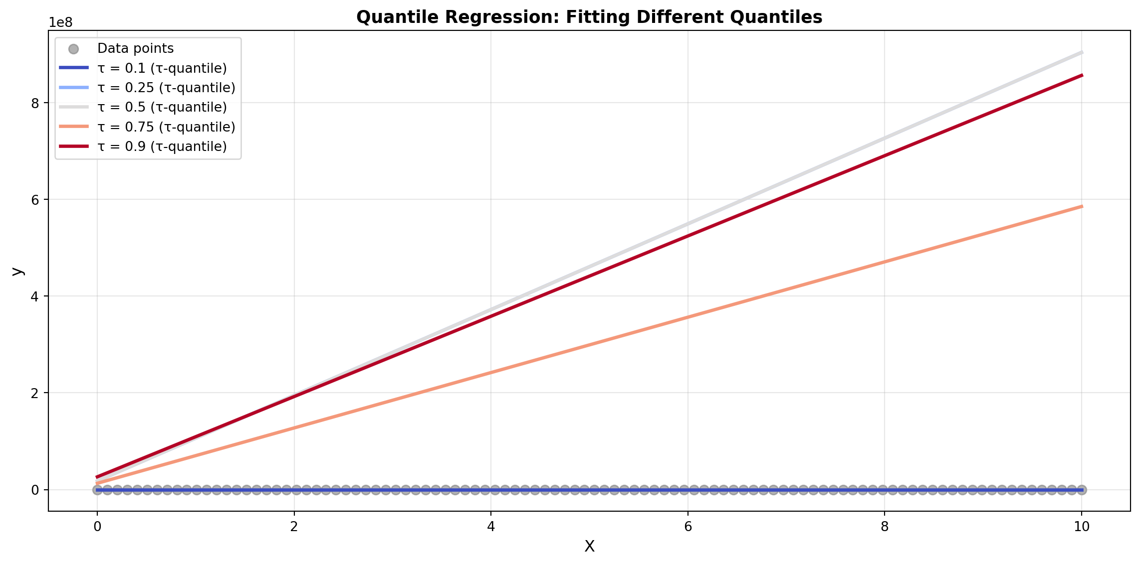
## Practical Example: Quantile Regression
Let's demonstrate quantile regression on synthetic data:
```{python}
from scipy.optimize import minimize

# Generate synthetic data
np.random.seed(42)
X = np.linspace(0, 10, 100)
# True function with heteroscedastic noise
y = 2 * X + 5 + np.random.normal(0, X/2)

# Define pinball loss for regression
def pinball_loss_regression(params, X, y, tau):
    """Compute pinball loss for linear regression"""
    predictions = params[0] * X + params[1]
    errors = y - predictions
    loss = np.where(errors >= 0,
                   tau * errors,
                   (1 - tau) * errors)
    return np.mean(loss)

# Fit models for different quantiles
quantiles = [0.1, 0.25, 0.5, 0.75, 0.9]
models = {}

for tau in quantiles:
    result = minimize(
        lambda p: pinball_loss_regression(p, X, y, tau),
        x0=[1, 0],
        method='BFGS'
    )
    models[tau] = result.x

# Plot results
fig, ax = plt.subplots(figsize=(12, 6))

# Scatter plot of data
ax.scatter(X, y, alpha=0.6, s=50, label='Data points', color='gray')

# Plot fitted quantile regression lines
X_line = np.linspace(0, 10, 100)
colors = plt.cm.coolwarm(np.linspace(0, 1, len(quantiles)))

for tau, color in zip(quantiles, colors):
    slope, intercept = models[tau]
    y_line = slope * X_line + intercept
    ax.plot(X_line, y_line, label=f'τ = {tau} (τ-quantile)',
            linewidth=2.5, color=color)

ax.set_xlabel('X', fontsize=12)
ax.set_ylabel('y', fontsize=12)
ax.set_title('Quantile Regression: Fitting Different Quantiles',
             fontsize=13, fontweight='bold')
ax.legend(fontsize=10, loc='upper left')
ax.grid(True, alpha=0.3)

plt.tight_layout()
plt.show()

print("\nQuantile Regression Model Parameters:")
print("-" * 40)
for tau in quantiles:
    slope, intercept = models[tau]
    print(f"τ = {tau:0.2f}: y = {slope:.3f}x + {intercept:.3f}")
```
## Applications
Pinball loss is particularly useful in:
1. **Risk Estimation**: Modeling confidence intervals and prediction bounds
2. **Demand Forecasting**: Predicting different service levels (e.g., 10th percentile for low demand, 90th for high demand)
3. **Financial Modeling**: Value at Risk (VaR) estimation
4. **Weather Prediction**: Probabilistic forecasting
5. **Robust Regression**: Less sensitive to outliers when using median (τ = 0.5)
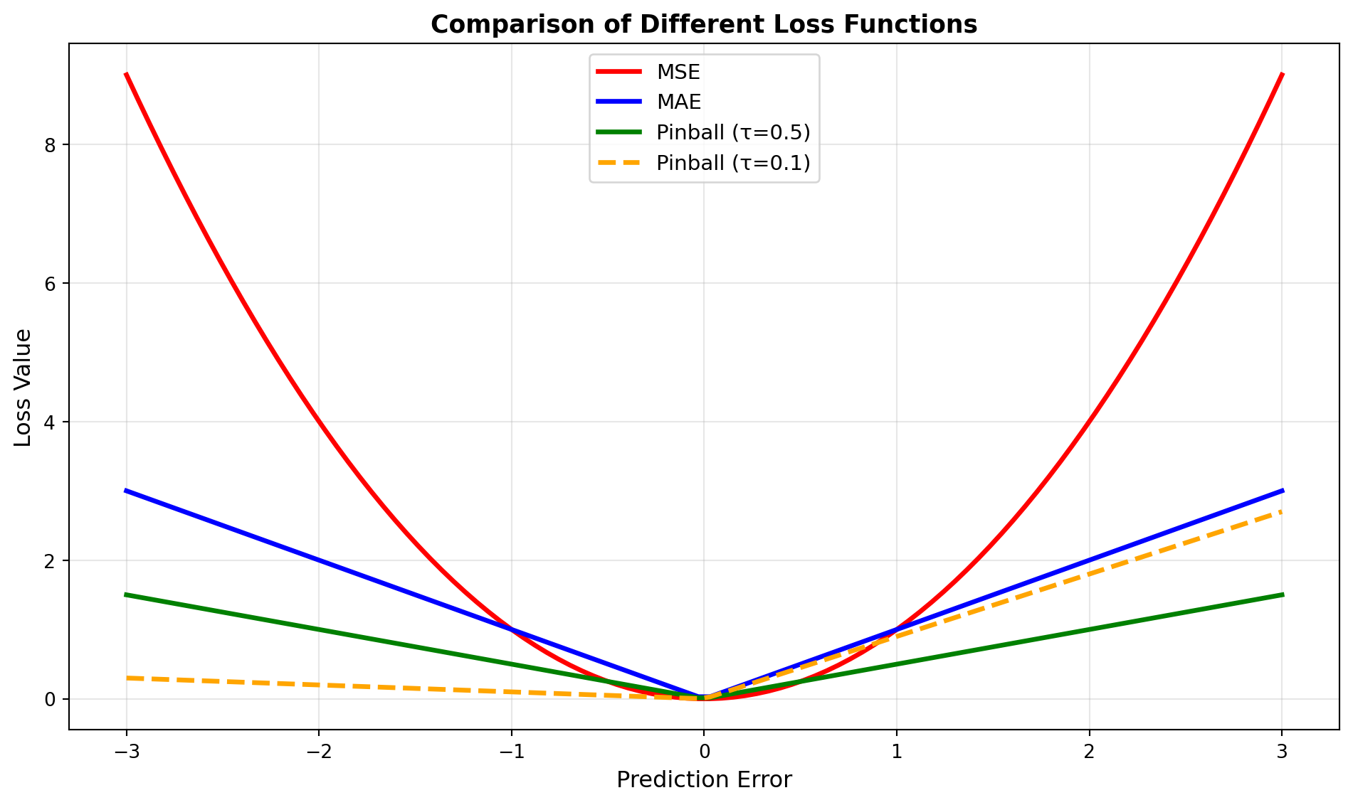
## Comparison with Other Loss Functions
```{python}
# Compare pinball loss with MSE and MAE
y_true = 0
y_pred = np.linspace(-3, 3, 100)

fig, ax = plt.subplots(figsize=(10, 6))

# MSE
mse = (y_pred - y_true) ** 2
ax.plot(y_pred, mse, label='MSE', linewidth=2.5, color='red', linestyle='-')

# MAE
mae = np.abs(y_pred - y_true)
ax.plot(y_pred, mae, label='MAE', linewidth=2.5, color='blue', linestyle='-')

# Pinball loss (τ=0.5)
pinball = np.where(y_true >= y_pred,
                   0.5 * (y_true - y_pred),
                   0.5 * (y_true - y_pred))
ax.plot(y_pred, np.abs(pinball), label='Pinball (τ=0.5)',
        linewidth=2.5, color='green', linestyle='-')

# Pinball loss (τ=0.1)
pinball_01 = np.where(y_true >= y_pred,
                      0.1 * (y_true - y_pred),
                      0.9 * (y_true - y_pred))
ax.plot(y_pred, np.abs(pinball_01), label='Pinball (τ=0.1)',
        linewidth=2.5, color='orange', linestyle='--')

ax.set_xlabel('Prediction Error', fontsize=12)
ax.set_ylabel('Loss Value', fontsize=12)
ax.set_title('Comparison of Different Loss Functions', fontsize=13, fontweight='bold')
ax.legend(fontsize=11)
ax.grid(True, alpha=0.3)

plt.tight_layout()
plt.show()

print("Loss function comparison plotted!")
```
## Summary
The Pinball Loss is a powerful and flexible loss function that:
- ✅ Generalizes MAE and other loss functions
- ✅ Allows asymmetric penalization of prediction errors
- ✅ Enables quantile regression for uncertainty estimation
- ✅ Is robust to outliers
- ✅ Has diverse real-world applications
By adjusting the quantile parameter $\tau$, practitioners can fine-tune their models to different business objectives and risk profiles.